960 Grid & Unsemantic CSS
The 960 Grid System.
The 960 Grid System is an effort to streamline web development workflow by providing commonly used dimensions, based on a width of 960 pixels. There are two variants that I like to use: 12 and 16 columns, which can be used separately or in tandem.
The 12-column grid is divided into portions that are 60 pixels wide. The 16-column grid consists of 40 pixel increments. Each column has 10 pixels of margin on the left and right, which create 20 pixel wide gutters between columns.
But the basic premise is ideally suited to rapid prototyping, as I’ve also found it works equally well when integrated into a production environment. There are printable sketch sheets, design layouts, and a CSS file that have identical measurements.
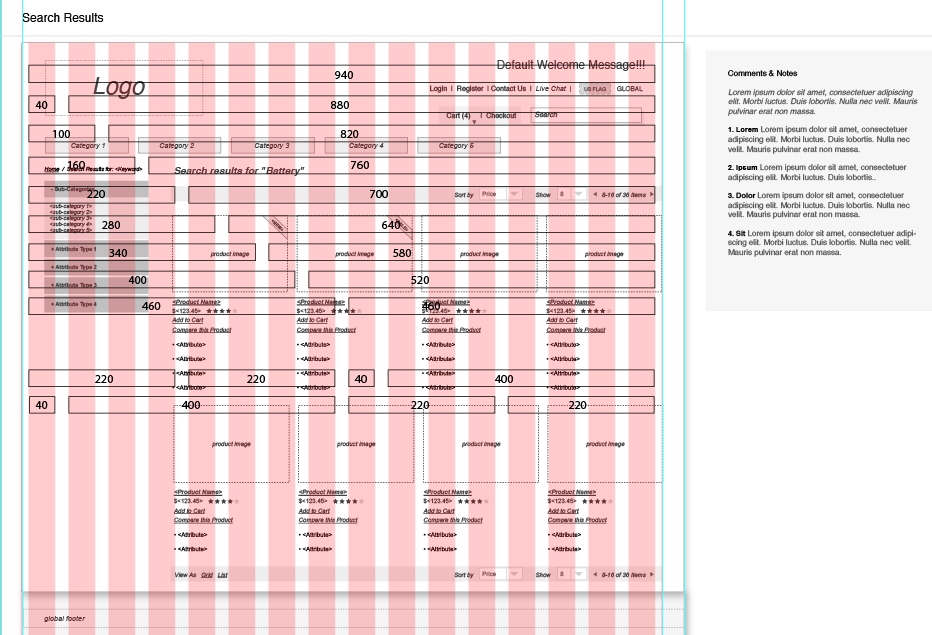
You can visit the 960 Grid site and click on their great ‘Big Ol’ Download button’ for a compressed file of many usable files to help your designers and developers alike. See below for an example of how I’ve used the grid. Don’t forget to keep reading to see the Responsive Web’s counterpart of the grid – Unsemantic.
Unsemantic CSS Framework
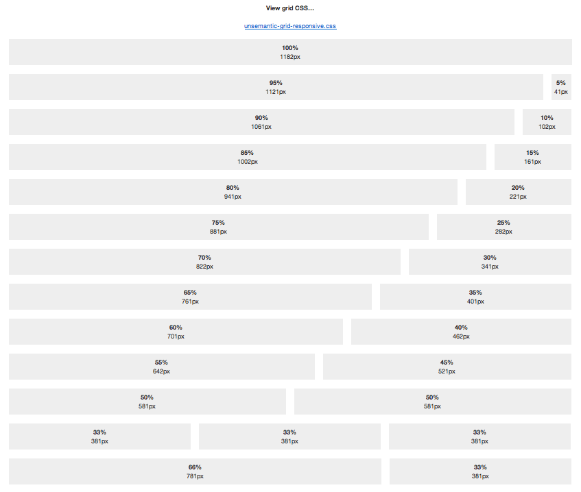
Unsemantic is a fluid grid system that is the successor to the 960 Grid System. It works in a similar way, but instead of being a set number of columns, it’s entirely based on percentages.
For instance, if you want a 50% wide column, simply use class="grid-50". There are grid classes for multiples of five: 5, 10, 15 … 95, 100. There are also grid classes for dividing a page into thirds: grid-33and grid-66.
By using push-x and pull-x classes, you can rearrange the visual layout of page, without affecting its source order. While SEO is a bit of a “moving target,” this has been known to help search engines determine the most relevant content on a page.

Typically, code at the top of a page is what search engines tend to focus on the most, and Unsemantic can help to ensure your source code is geared towards that goal.
Unsemantic was built with extensibility in mind, using Sass and Compass. While you can use the CSS as is, some developers prefer to use their own class names, and want only the bare minimum CSS required for a particular page.
To that end, you can use a “silent” Sass approach, and write your own Sass code to use Unsemantic’s base styles. For instance, there’s a placeholder named %grid-container.


Leave a Reply